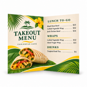
Good graphic design makes the message easier to notice, understand and remember. The best-looking layout still fails if readers cannot find the important information—or if the design falls apart when it moves from screen to print.
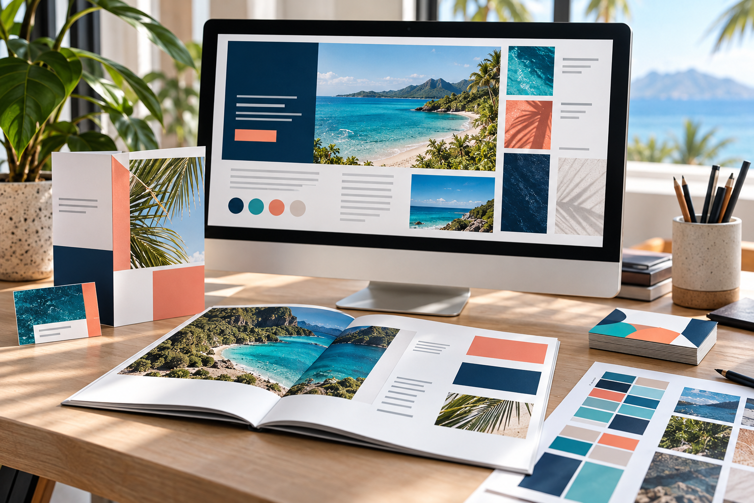
These graphic design essentials provide a practical framework for business cards, brochures, postcards, signs, menus and other marketing pieces. They are not rigid rules; they are tools for making intentional decisions.
1. Begin with purpose and audience
Before choosing colors or fonts, define what the piece must accomplish. Is the reader supposed to visit a location, scan a QR code, remember a brand, compare services or respond to an offer? A design for a trade-show banner has a different viewing distance and decision window from a detailed brochure.
- Identify the primary audience.
- Choose one main action for the reader.
- Decide what information must be understood first.
- Remove content that does not support the purpose.
2. Create a clear visual hierarchy
Hierarchy tells the eye where to begin and what to read next. Size, weight, color, position and spacing can make a headline dominant, supporting details easy to scan and a call to action unmistakable.
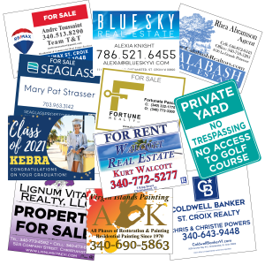
A useful test is to glance at the design for three seconds. Can you identify the subject, the organization and the next step? If every element is equally loud, nothing feels important. Limit the number of competing focal points and give the key message room to lead.
3. Use typography for clarity and character
Typography communicates before the words are fully read. Choose typefaces that support the brand and remain legible at the final size. A disciplined system often needs only a headline style, a body style and perhaps one accent treatment.
- Use meaningful contrast between headings and body copy.
- Keep body text large enough for the audience and viewing conditions.
- Avoid long lines, cramped leading and excessive all-capital text.
- Use alignment consistently instead of placing each item independently.
- Check font licensing and embedding before production.
Our guide to choosing fonts for print explains readability, font formats and production considerations in more detail.
4. Choose color with intention
Color can establish mood, reinforce recognition and organize information. Start with a controlled palette and assign each color a job. A dominant brand color, a neutral foundation and one accent are often more effective than many unrelated colors competing for attention.
Contrast matters as much as color choice. Text must separate clearly from its background, and important differences should not rely on color alone. Remember that paper, ink, coating, lighting and screen calibration affect appearance. See RGB vs. CMYK for printing before judging print color solely from a monitor.
5. Use spacing, grids and alignment
White space is not wasted space. It separates ideas, improves reading and makes important elements more visible. A consistent grid creates relationships between headings, images, text and calls to action—even when the grid itself is invisible.
- Align related elements to shared edges.
- Group items that belong together and separate items that do not.
- Use consistent margins and spacing intervals.
- Keep critical content away from trim, folds and binding areas.
- Check balance at the actual finished size, not only while zoomed in.
6. Select imagery that supports the message
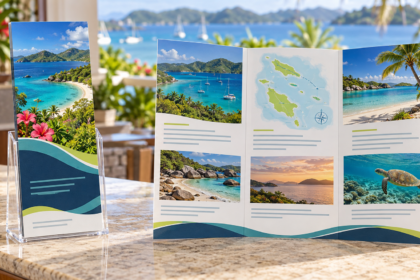
Images should clarify the idea, create relevant emotion or show the product in context. A sharp, authentic photograph usually contributes more than several weak decorative images. Use consistent cropping, color treatment and visual style so the piece feels intentional.
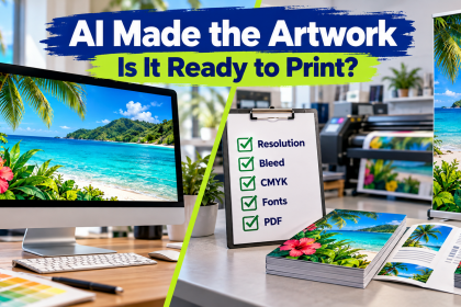
For print, confirm that raster images have enough effective resolution at final size. Do not enlarge small website images and expect new detail to appear. Vector artwork is preferable for logos, icons and simple illustrations that must scale cleanly. If you are using generated imagery, review our AI artwork print-readiness guide.
7. Maintain brand consistency
Consistency turns individual pieces into a recognizable system. Use the same approved logo files, color references, typography, image style and tone across print and digital materials. Consistency does not require every layout to look identical; it means the same brand logic is visible in each application.
Design for the final printed object
A design is not finished until it works in its real form. Consider the stock, size, folds, binding, finish, viewing distance and environment from the beginning. Fine detail that works on a brochure may disappear on a banner. A fold can interrupt a headline. A glossy finish can change perceived contrast.
Build to the correct dimensions, extend artwork through the bleed, protect the safe area and export using the printer’s specifications. Our print-ready file checklist covers the production details.
A quick graphic design review
- Is the purpose immediately clear?
- Does the most important message lead the hierarchy?
- Is the typography readable at final size?
- Do color and contrast support comprehension?
- Are spacing and alignment consistent?
- Does every image earn its place?
- Does the piece look and sound like the brand?
- Has the design been checked for the final print process?
Need a design that works as well in print as it does on screen? Tell CPM about your project. We can help shape the artwork, prepare it for production and recommend the right printed format for your audience in the Virgin Islands.