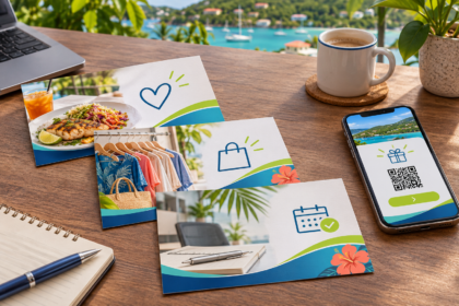
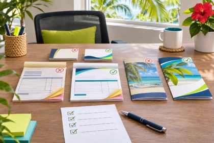
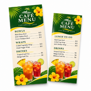
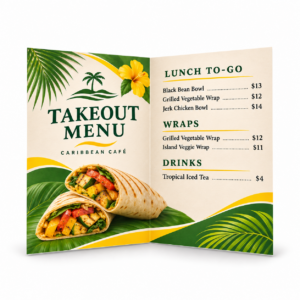
Rack cards and brochures are both effective ways to put information directly into a customer’s hands, but they are not interchangeable. One is designed to make an immediate impression in a small display space. The other gives you room to explain, organize and persuade.
For Virgin Islands businesses, the better choice often depends on where the printed piece will be found, how much the customer needs to know and what you want that person to do next.
Choose the format based on the job
Before deciding between a rack card and a brochure, define the piece’s primary purpose.
Are you trying to catch the attention of a visitor walking past a hotel display? Are you explaining several services during a sales conversation? Will customers take the piece with them and refer to it later? Do you need a map, price list, schedule or detailed instructions?
A printed piece works best when its format supports one clear job. Trying to fit a brochure’s worth of information onto a rack card usually creates tiny type and visual clutter. Spreading a simple offer across a multi-panel brochure can make the message feel more complicated than it is.
When a rack card is the better choice
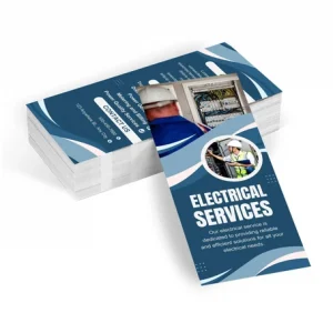
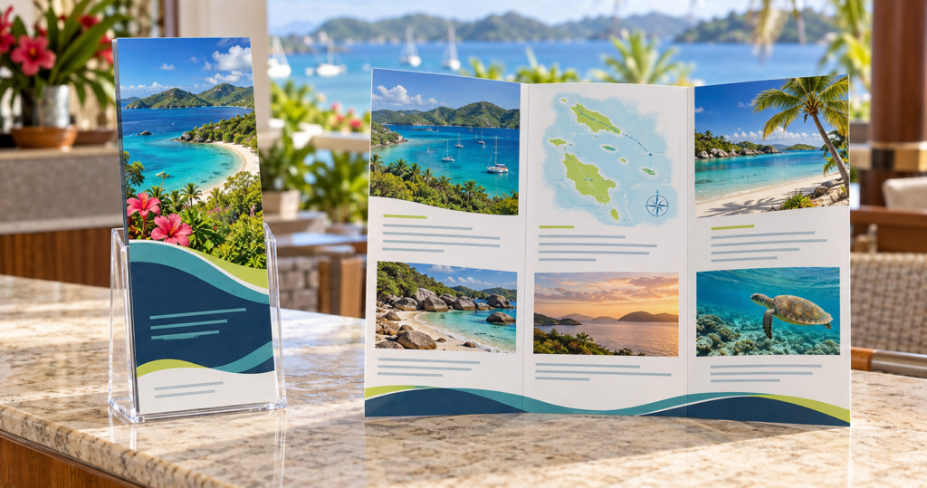
A rack card is a narrow, two-sided promotional piece commonly displayed in racks at hotels, visitor centers, restaurants, rental counters and other high-traffic locations. Its upright shape allows the headline and main image to remain visible even when the lower portion sits inside a holder.
Rack cards are particularly effective for:
- Tours, attractions and excursions
- Restaurants and entertainment venues
- Museums, galleries and historic sites
- Rental services and transportation
- Events and limited-time offers
- Simple service promotions
The front should do most of the attention-getting. A strong photograph, recognizable business name and short benefit-focused headline can tell someone within seconds whether the card is relevant. The back can provide supporting details, contact information, a QR code, directions or a concise call to action.
A rack card is usually the stronger option when the audience is browsing several choices and deciding what deserves a closer look.
When a brochure earns the extra space
A brochure is better when the reader needs more information before making a decision. Folding divides the content into panels, allowing related information to be grouped into a deliberate reading sequence.
Brochures work well for:
- Companies offering several related services
- Resorts, villas and property managers
- Medical, financial and professional services
- Nonprofit programs and public information
- Product lines that require comparison or explanation
- Organizations that need space for maps, schedules or instructions
A tri-fold brochure can introduce the organization on the cover, explain key services inside and finish with contact information and a next step on the back. Other folds and larger formats may be appropriate when the content calls for a different sequence.
The advantage is not simply “more room.” It is the ability to organize information. Adobe’s brochure guidance recommends planning around the audience, purpose and budget, while avoiding walls of text or too many competing images. A brochure should make a detailed subject easier to understand—not give the business permission to include everything it knows.
Consider where customers will receive it
Distribution should influence the format from the beginning.
If the piece will sit in a standard display rack among competing attractions, a rack card is the natural fit. If a salesperson will hand the piece to a customer and talk through several options, a brochure may provide better support. For front desks, welcome packets, trade shows and community events, either format can work depending on the message.
Also consider how the piece will travel. Visitors may place it in a purse, backpack or rental car. Business customers may keep it in a folder or share it with a colleague. A compact format is valuable only if the essential information remains readable and useful.
If the piece will be mailed, do not assume that a familiar print size automatically qualifies for the mailing method you intend to use. Postal classifications depend on dimensions, thickness, weight and preparation. Confirm the requirements before the design is finalized—especially for Every Door Direct Mail or other bulk-mail programs.
Give every panel and side a purpose
The front of either format should answer a basic question: “Why should I pick this up?”
From there, organize the information around what the customer needs most:
- What the business, service or experience offers
- Who it is for
- Why it is different or worthwhile
- What the customer should do next
- How to call, visit, book, scan or learn more
Avoid treating every inch as space that must be filled. White space helps separate ideas and directs attention. Short headings, concise paragraphs and carefully selected photographs are usually more effective than dense copy and numerous small images.
A QR code can connect the printed piece to current schedules, online booking, menus or expanded details. It should support a clear call to action and be tested at its final printed size before production.
Use photographs that sell the experience
In the Virgin Islands, many businesses are marketing an experience as much as a product. Strong images can show the view from a tour, the atmosphere of a restaurant, the comfort of a property or the personality behind a local service.
Use original, high-quality photography whenever possible. Images copied from a website or social-media post may not contain enough detail for sharp printing. Logos are generally best supplied as vector artwork, and the design should be created at the correct finished dimensions.
If color or an image extends to the edge, the artwork also needs bleed beyond the trim line. Adobe’s print-production guidance recommends confirming bleed and printer’s-mark settings when exporting a print-ready PDF. CPM can review the file requirements before production so the artwork is built correctly from the start.
Do not choose by price alone
A rack card may use less paper and appear simpler, while a brochure requires folding and often more design work. But the least expensive format is not the better value if it cannot communicate the message.
The right comparison is not “Which piece costs less?” It is “Which piece is more likely to be picked up, understood and acted upon?”
For a single attraction or focused offer, a rack card may deliver everything the customer needs. For a company with multiple services or a decision that requires explanation, the additional space and structure of a brochure may produce a better result.
Let the message determine the format
Start with the audience, distribution location, amount of information and desired next step. Once those decisions are clear, the choice between a rack card and brochure becomes much easier.
Caribbean Printing & Marketing can help you select the appropriate size and format, organize the content, review the artwork and coordinate production and delivery in the U.S. Virgin Islands.
Planning a rack card or brochure? Send CPM your content, intended distribution location and quantity, and we will help you determine which format best fits the job.