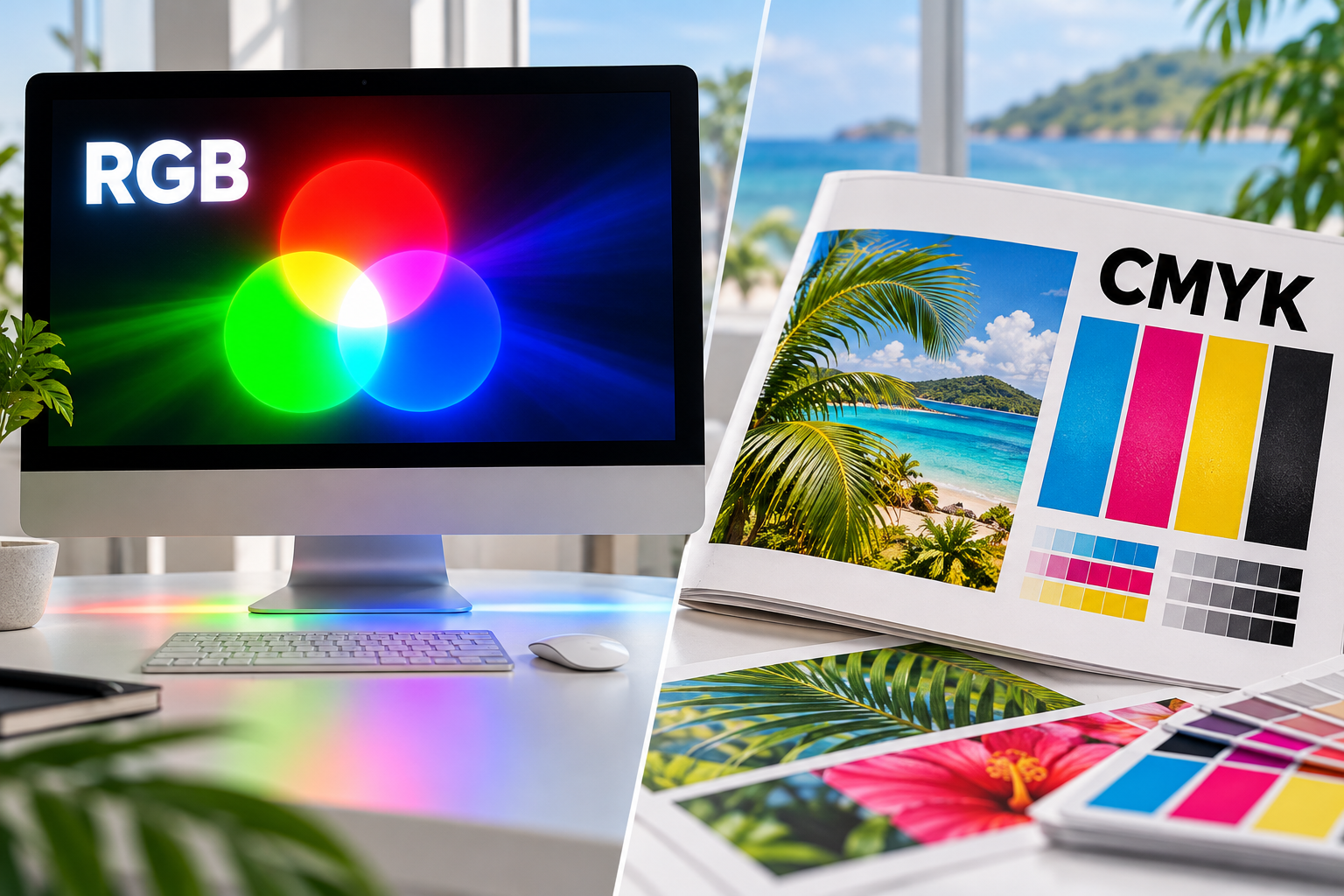
RGB is built for light. CMYK is built for ink. The important question is not simply which mode is “correct,” but how color will move from the screen to the specific printing process.
Every printed project begins on a screen, but a screen and a press create color in fundamentally different ways. That is why a bright blue, green or orange can look vivid in a design file and more restrained on paper. Understanding RGB vs. CMYK helps you make better decisions, set realistic expectations and give your printer the information needed for predictable output.
What is RGB?
RGB stands for red, green and blue. It is an additive color model used by phones, monitors, cameras, scanners and other devices that create color with emitted light. As the three channels overlap at high intensity, the result moves toward white; with no light, the result is black.
“RGB” does not describe one universal set of colors. sRGB, Adobe RGB and Display P3 are different RGB color spaces, each with its own gamut. An embedded ICC profile tells color-managed software what the numbers in a file are intended to mean.
What is CMYK?
CMYK stands for cyan, magenta, yellow and black. It is a subtractive process: inks absorb portions of the light reflected by the paper, and the remaining light creates the color we see. The paper, ink or toner, press and finishing all influence the final appearance.
The K channel provides a practical, neutral black for text, shadows and detail. Some production systems add extra inks or toners to extend the printable range, but CMYK remains the foundation of much commercial process-color printing.
Why screen and print do not match exactly
- A monitor emits light, while print reflects the light in the room.
- RGB and CMYK gamuts differ, so some highly saturated screen colors cannot be reproduced in a particular print condition.
- Paper white, coating and texture affect color, contrast and detail.
- Monitor brightness and calibration vary from one screen to another.
- The press, ink or toner, output profile and finishing process can all change the result.
This does not mean CMYK is bad or RGB is wrong. It means conversion is a managed translation between devices.
Should you convert artwork to CMYK before sending it?
Follow the printer’s specifications. Some workflows accept—or even prefer—properly tagged RGB images and convert them through the correct output profile. Others require a final CMYK or PDF/X file. Converting too early to a generic CMYK profile can discard useful color information and make later correction harder.
- Keep source images with their embedded profiles.
- Export a high-quality PDF using the preset your printer requests.
- Do not assign a new profile merely to change how a file looks; assigning and converting are different operations.
- Check spot colors, transparency and overprint separately from RGB-to-CMYK conversion.
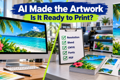
If you do not have production specifications, send CPM the original editable artwork along with your print-ready PDF and ask before converting. For generated graphics, our AI artwork print-readiness guide covers other issues that can affect output.
Use soft proofing to preview likely changes
Soft proofing uses an output profile to simulate how a file may reproduce under a specific print condition. In Adobe Photoshop, Proof Setup and Proof Colors can help reveal out-of-gamut colors, shifts in contrast and the effect of paper white before production.
A soft proof is most useful on a calibrated monitor set to a sensible brightness. It is still an approximation—not a guarantee. For critical brand colors, a physical contract proof, approved sample or specified spot color provides stronger guidance.
A practical file-preparation checklist
- Confirm the finished size and required bleed.
- Use images with enough resolution at final size.
- Embed color profiles instead of stripping them.
- Use the PDF or PDF/X standard requested by the printer.
- Inspect black text separately from large black areas.
- Proof names, prices, dates, phone numbers and QR codes.
- Provide Pantone or other spot-color references, or a physical sample, when brand color is critical.
- Do not treat an uncalibrated screen or office printer as a contract proof.
Typography can also cause production surprises. See how to choose and prepare fonts for reliable printing.
What about rich black?
Small text and fine rules normally use 100% K to reduce registration risk. Large black areas may benefit from a rich-black build, but the correct values and total ink limit depend on the printing process, substrate and output profile. Do not apply one universal CMYK formula to every job—ask CPM or your printer for the appropriate build.
RGB vs. CMYK: the short answer
- Screen-only work: use RGB; sRGB is often the safest general-purpose delivery space.
- Commercial print: supply files according to the printer’s specifications. CMYK and PDF/X are common, while tagged RGB may be accepted in a managed workflow.
- Critical color: use embedded profiles, soft proofing and an approved physical proof or spot color when appropriate.
Before you send the file
Not sure whether your file is ready? Send CPM the artwork, finished size and intended product. We can review the color setup before production and recommend the safest path for your project in the Virgin Islands. Request a print quote.