The right fonts make printed material easier to read, easier to recognize and easier to produce correctly.
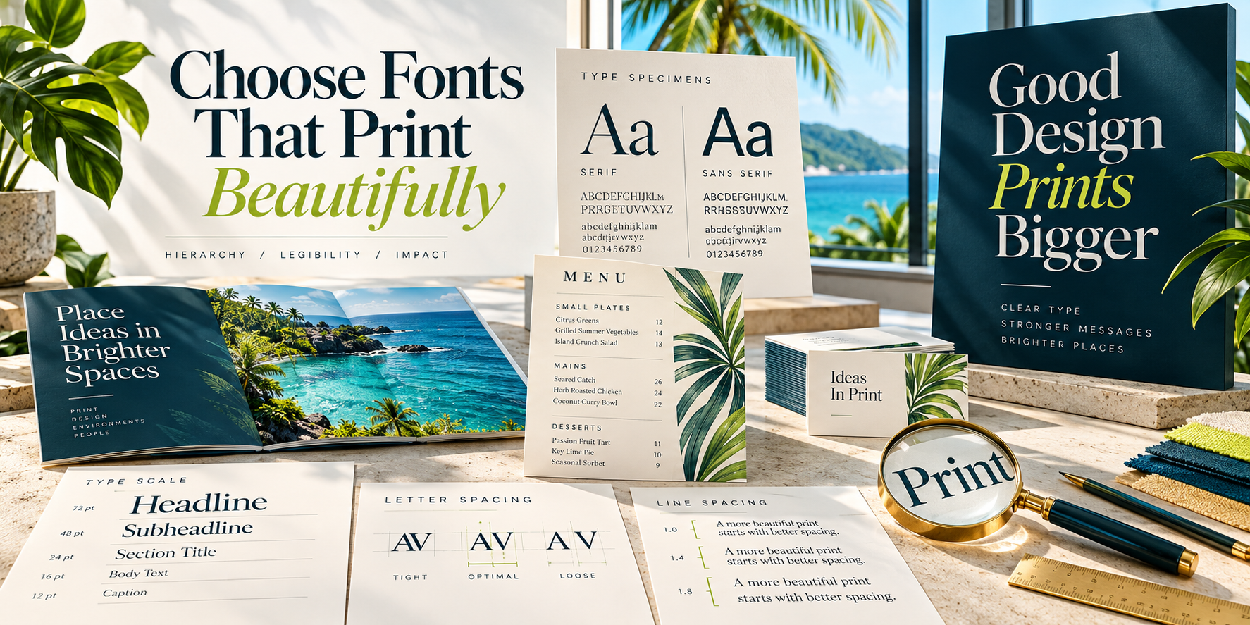
Typography is not decoration added at the end of a design. It organizes information, gives a brand a voice and helps the reader understand what matters first. A typeface that looks attractive on a laptop can still fail in print if it is too thin, too small, poorly spaced or missing from the final file.
Start with the job the type must do
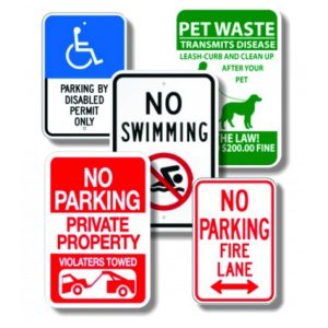
Choose fonts for the format and viewing conditions. A menu must remain comfortable to read under restaurant lighting. A brochure needs clear hierarchy across several levels of information. A business card has limited space. A roadside sign must communicate in seconds from a distance.
Use hierarchy before adding more fonts
Most projects need fewer typefaces than people expect. Create contrast with size, weight, color and spacing before introducing another font family.
- Headline: the first idea the reader should notice.
- Subhead: a clear supporting thought or section label.
- Body copy: comfortable reading at the intended size.
- Caption or detail: secondary information that remains legible.
- Call to action: visually distinct and easy to act on.
Pair fonts by role, not novelty
A dependable combination is one expressive face for headlines and one highly readable face for body copy. Serif and sans-serif families can pair well when their proportions and tone feel compatible. Avoid combining several fonts that all compete for attention.
Script, novelty and ultra-condensed fonts are best used sparingly. They may work for a short name or accent, but long passages, all-capital script and tight spacing can quickly become difficult to read.
Design for real print size
Zoom level can be misleading. View the layout at 100 percent and print a proof at actual size. Fine strokes may fill in or disappear, reversed text can lose clarity, and a paragraph that feels generous on screen may be uncomfortably small on paper.
- Use sufficient contrast between text and background.
- Avoid very light weights for small text.
- Give reversed white text extra weight and space.
- Increase line spacing for longer passages.
- Do not stretch or squeeze a font to make it fit.
- Test signs from the intended viewing distance.
Keep branding consistent
Define a small, repeatable type system for brochures, forms, presentations, signs and digital content. Record approved font families, weights and typical uses. Consistency helps customers recognize the brand and keeps new projects from drifting into a different visual personality.
Check licensing before sharing files
Fonts are software and are governed by licenses. A license that permits use on one computer may not permit redistribution to another designer or printer. When a printer does not have the typeface, supply a properly packaged project only if the license allows it, or export an approved print-ready PDF with fonts embedded.
For final artwork that will not need text editing, outlining display type can prevent substitution—but always keep an editable original. Outlined text no longer behaves like text and cannot be corrected easily.
Avoid font problems in the final PDF
- Export a print-ready PDF rather than relying on the application file alone.
- Review the PDF on a different computer when possible.
- Check that characters, symbols and accented letters display correctly.
- Confirm that bold and italic styles are real font styles, not synthetic effects.
- Ask before outlining large amounts of body copy.
Adobe Acrobat can report which fonts are embedded in a PDF. PDF/X standards also help package fonts, images and color information for dependable print production.
Choose readability over fashion
A good font choice supports the message without making the reader work. Start with the audience, format and viewing distance; build a clear hierarchy; test at actual size; and deliver a PDF that preserves the approved typography.
Not sure whether your typography will reproduce well? Send CPM the artwork and finished size. We can review the file before production and recommend practical corrections.